- Solutions
-
-
Featured Solution
 Get more value from your existing SAP BW and SAP HANA investments with our SAP integrations.
-
-


At Pyramid we breathe and sleep data, and for some of the team, they breathe and sleep data and football. So, in honor of the upcoming Super Bowl, we put some football dashboards together. Look at some fun facts around the Super Bowl in dashboard 1, and see key Post Season stats for the Chiefs vs. 49ers in dashboard 2.
We also put together a second dashboard focused on the two teams playing in the 58th Super Bowl – the Kansas Chiefs against the San Francisco 49ers. This dashboard includes the most recent post season stats such as offensive yards, firstdowns, touchdowns and penalties as well as a look at quarterbacks Patrick Mahomes’ and Brock Purdy’s stats.
How to Interact with the Dashboard
Pyramid dashboards are all about interactivity and visually seeing how data points interact, by offering an intuitive user experience. Start on the left (“Teams with the Most Super Bowl Wins”) and click on a team to dynamically update the related data on the right. These include the most viewed Super Bowls, host states, top MVPs, wins by conference, and the coin toss by conference.
Add in or Swap Data Points
The data presented isn’t static and there are a lot of other data points. Add in more data points relating to the team or Super Bowl such as MVPs, coaches, conferences, or divisions. You can also slice and dice data by choosing to swap or remove data points.
You can also gain a more in-depth understanding of the data by clicking on Smart Insights, the first icon shaped like a crystal ball. There are 3 types of insights, which can be selected from the top right tab, which automatically starts with “light”.
Alternatively change what you see on the screen by asking the Natural Language Querying Chat to add, replace or remove data, or change how the visuals look among other queries.
Looking at the Teams in More Depth

BI Trends
See it in action SAP recently retracted permission to legitimately extract ERP data from…

Augmented Analytics
Adding Gen BI to your data analytics can empower your business to create any desired…

Augmented Analytics
Generative BI brings together the power of GenAI and analytics to enable an on-demand super-fast…

Augmented Analytics
Pyramid’s natural language interface functionality now includes speech input and output. This means a user…

Augmented Analytics
Generative AI opens up the data analytics world to more capabilities, including conversing with your…

Augmented Analytics
The LLM (large language models) market is growing exponentially and is set to quadruple in…

Augmented Analytics
If you're looking to take your analytics game to another level, Pyramid’s latest set of…
BI Trends
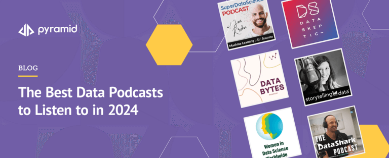
Data is everywhere and has spread into the podcast world. With so many data-themed podcasts…

BI Trends
2023 was the year of AI in almost every industry. However, when it comes to…