
- Solutions
-
-
Featured Solution
 Get more value from your existing SAP BW and SAP HANA investments with our SAP integrations.
-
-


Pyramid’s AI-driven “Explain” feature allows users to dig directly into their source data with a single click, giving them faster insights into key drivers and influencers through automated analysis with little effort.
Real insight into data is usually only gained after traversing, and mining mounds of data until the golden nuggets are finally found. Rather than manually drilling into the data, using intuition, or educated guesses to choose dimensional elements to find what’s driving results, “Explain” automatically determines the elements that contribute to a data point’s value.
A huge amount of time-consuming effort is usually expended to source data, manipulate it, and arrive at insights. Analysts need to devote considerable time combing through a myriad of permutations of hierarchies and metrics, looking for drivers influencing high concentrations of values and/or average values. An automated AI function would be the ideal solution to this quagmire. Often BI tools don’t provide such capabilities directly on any data source requiring data ingestion first. And then, they can only perform automated analysis on predefined metrics and hierarchies, effectively relinquishing the self-service, on-demand functionality.
Pyramid’s “Explain” feature performs automated analysis in a single, on-demand click without requiring any data preparation or complex development. Insights can be gleaned immediately against any data source. An advanced machine learning algorithm is used to automatically traverse all hierarchies and metrics, finding the most significant drivers and influencers behind the values in question.
The Explain feature deploys a two-pronged approach, analyzing both high concentrations of values and influencing factors, revealing the most significant items and metrics.
The feature combines automatically generated textual commentary with graphical representations. While an advanced interface exposes a larger set of contextual reports and AI-generated explanations for each selected node.
The depth and intensity of the algorithm can be customized to suit the user’s requirements in an intuitive, user-friendly interface. While all generated insights, reports, and dashboards can be saved as standard artifacts and further enhanced using Pyramid’s Analytics platform.
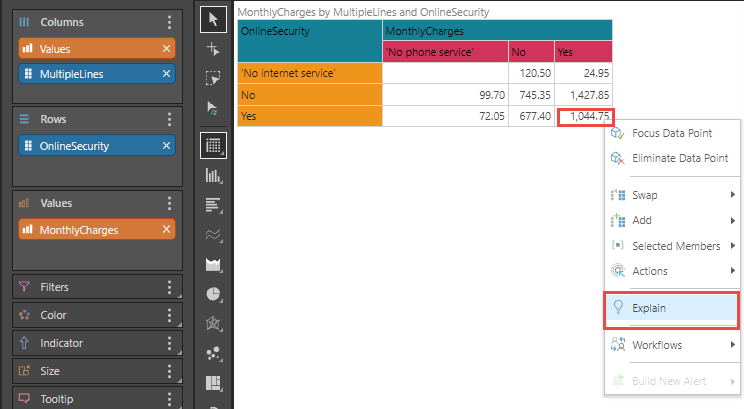
Amy, a business analyst at XYZ Telco, uses Pyramid to analyze data from her SAP system using HANA Calculation Views. During her analysis, she discovers that the monthly charge for customers with multiple phone lines and online security is $1,044. She wants to understand why it’s so high and what other items in the data best explain its value.
Amy right-clicks on the data point and selects “Explain,” triggering the underlying query engine to retrieve all the details for that data point across the ENTIRE data model and present it to the Explain machine learning engine for automated analysis.
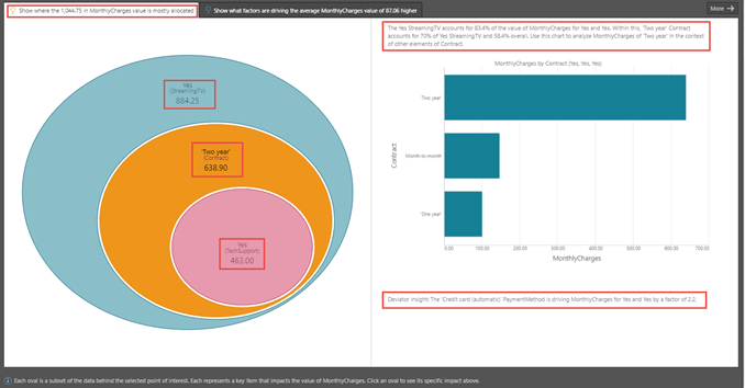
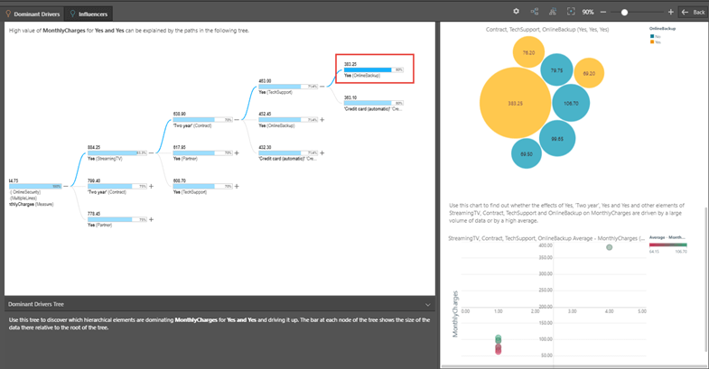
Within a few seconds, Amy can start to review the results (shown below). First, she reviews the first tab that explains what items dominate the value drivers shown in the “eyeball” diagram. It shows that customers with streaming TV (StreamingTV = “Yes”) are the most significant element and account for $884.25. Within that, two-year contracts account for $638.90, and within that, $463 is accounted for by customers who have technical support. By clicking on the middle oval, she can also see textual commentary describing the breakdown on the right-hand side, with a contextual column chart depicting how the Two-year contract monthly charges compare with other members in the contract hierarchy.
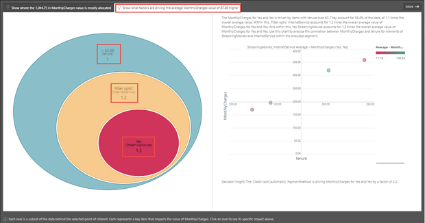
Next, Amy wants to determine what factors are pushing the average value of monthly charges higher for the specified data point. This may give her a sense of the relative sizing versus absolute value concentrations.
She clicks on the second tab (the influencers tab), where the AI engine traverses all hierarchies AND other metrics in the data model, using average values to determine the impact rather than a simple summation. Here it shows that when the contract tenure is greater than 63 days, it has an impact of just 1, while within that, a fiber optic internet service has a 1.2 impact (which means those customers with this option pay 20% more on average in monthly charges). And finally, any customers with streaming members impact the average value of monthly charges by 30% or 1.3. (Factors over 1.0 contribute to increasing average values, while factors below 1.0 contribute to decreasing average values).
Now, Amy wants to increase the depth and breadth of her analysis – and moves to a more advanced interface.
She first selects three branches and four levels in the search parameters and views the results in a tree. Here Amy can see two additional branches on each level. So, in the first level, she can now view a two-year contract and partner = “Yes”; on the second level, she can view Partner = “Yes” and Tech Support = “Yes” within the context of Streaming TV = “Yes” etcetera. The tree also stretches down to a fourth level where she can view Online Backup = “Yes” and Payment method = “Credit card automatic” within the context of TechSupport = “Yes.”
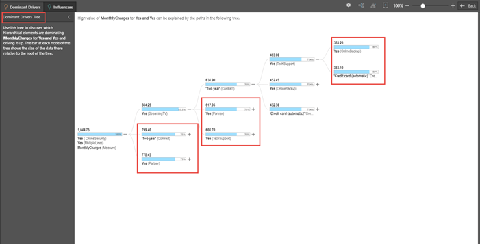
And finally, Amy wants to perform a detailed analysis of the Online backup node on the fourth level. By clicking on it, the advanced interface also exposes a dashboard containing four contextual reports with automatically generated explanations.
The Explain feature has effectively allowed Amy to perform detailed analysis with a single click in a few minutes, directly against her SAP HANA data source, without requiring any ETL, ingestion, or data manipulations.
Pyramid’s “Explain” feature performs automated analysis directly against any data source in a single, on-demand click. “Explain” finds the most significant drivers and influencers for a selected data point by automatically traversing all hierarchies and metrics. It analyzes high concentrations of value and influencing factors for increasing or decreasing average values, combining textual commentary with graphical representations to highlight results.

How-To
SAP is essential enterprise software. Your organization has made significant investments in SAP. You've tailored…

How-To
Pyramid’s built-in multi-factor authentication (MFA) option adds a rock-solid layer of security to your BI…

How-To
Administrators occasionally need to check complicated settings and security structures for users. Sometimes the easiest…

How-To
Pyramid lets users customize and personalize the labels of value metrics and hierarchies for a…
How-To
Static data format masks, used to format values in analytics) is a standard feature in…
How-To
Pyramid lets users display multiple value metrics in a single report, each with its own…

How-To
Pyramid’s persistent color feature maintains the same color in all visualizations for selected data elements,…

How-To
Pyramid offers flexible, intuitive security for parent-child hierarchies, providing role-based control over how members are viewed…
How-To
Pyramid excels in its’ native support for parent-child hierarchies, automatically generating hierarchical structures and providing fluid,…