
- Solutions
-
-
Featured Solution
 Get more value from your existing SAP BW and SAP HANA investments with our SAP integrations.
-
-


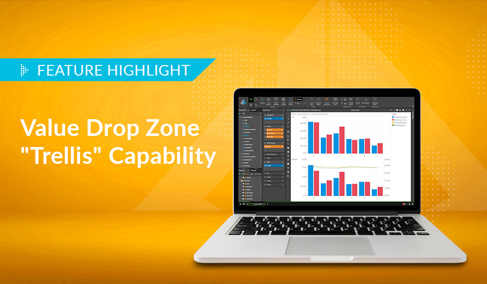
Pyramid lets users display multiple value metrics in a single report, each with its own graphical visualization, providing greater flexibility in displaying analytic content.
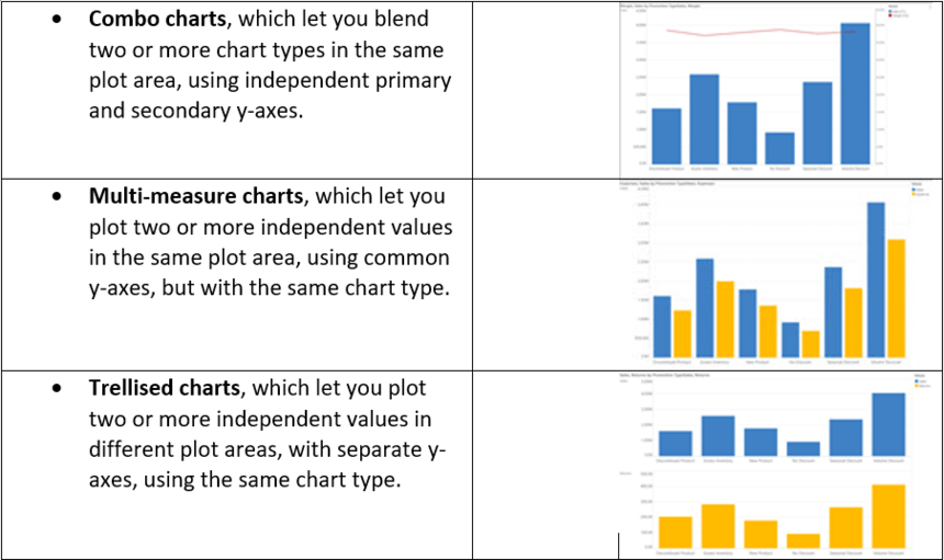
Pyramid has had various options to shown different values in the same chart or report, including:
We have added a new option: the ability to use the trellising chart capability with the option to also change chart types per metric via simple, yet sophisticated drop zone tools. This flexibility provides more options for users to better show and understand their data.
Why is it needed?
Comparing data with multiple measures in a single chart can be misleading with different scales that apply to the different measures. For example, gross revenue for different sales representatives might be in a range between $500k and $800k, while their net profit might be between $100k and $200k and their margin percentage between 5% and 10%. Allowing multiple charts with different y-axis calibrations greatly improves comprehension by magnifying variations of smaller amounts—and removing the ambiguity of using a single measure scale. This then allows users to show distinct chart types for each metric to better depict the underlying data. For example, instead of using a column chart for margin, a user might want to use a line chart for improved graphic illustration.
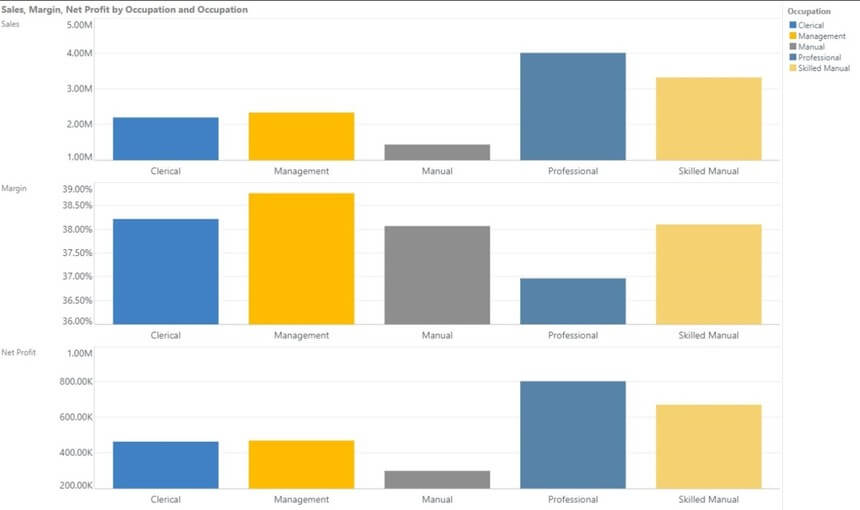
This chart illustrates how sales, net profit, and margin can’t be meaningfully depicted on a single chart.
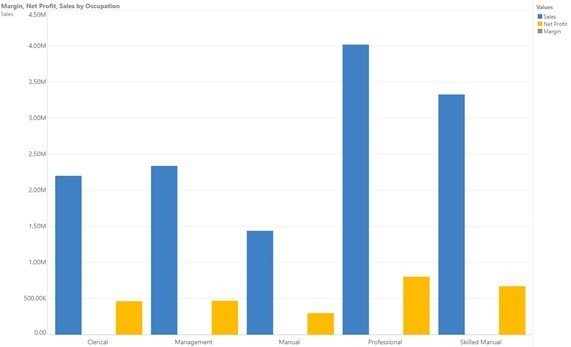
The range for the margin amount is between 37% and 39%—so low that it isn’t recognizable on the y-axis.
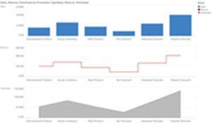
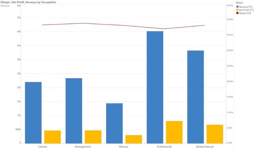
So, one way to address this is to use combo charts with primary and secondary axes.
The chart below suddenly allows the margin metric to be clearly visible in the same chart plot as the other two metrics, using both a different chart type (line) and a different y-axis.
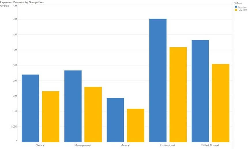
If the measures were of similar scale, then a shared-primary axis chart could also work. For example, revenue and expenses have a similar range of values and can be accommodated on the same y-axis.
In the chart below, both revenue and expense values are shown on a single plotted chart, sharing the same y-axis.
Another technique, when the measures had different value scales, is to let the application trellis the results so the y-axis scale changes per plot of each measure.
In the chart below, we get three charts: one for sales, margin, and net profit. By separating them into three distinct plots, each one has its own y-axis values and scale.
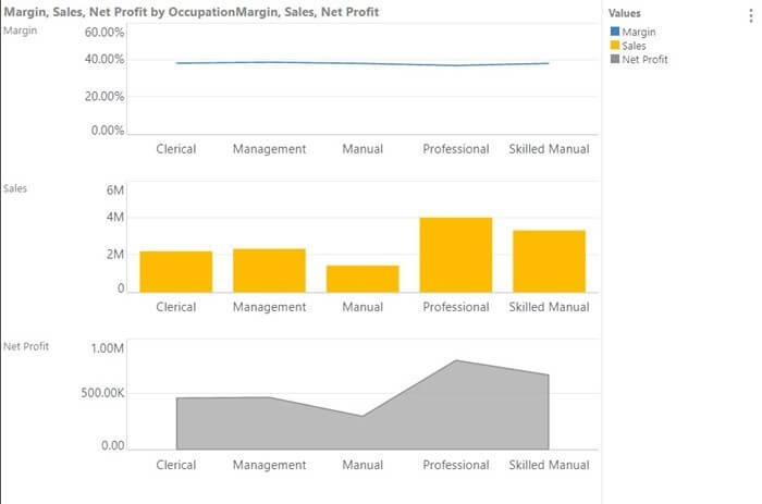
But what if we want different chart types for each measure in the above trellised plot, so that the margin can be displayed as a line chart, sales as a column chart, and net profit as an area chart?
This can now be achieved by using the new “trellis” sub-drop zone choice and choosing the appropriate chart option.
You can see the effect in the chart below, with each measure in its own plot, its own y-axis and scale, and its own chart type.
There are many nuances to drawing multi-metric charts. Pyramid supports various approaches through the simplicity of its drag-and-drop drop zone interface. Through this framework, multiple measures with different scales are more easily understood in separate charts with different y-axis ranges, making the analysis easier to read and use, and therefore more impactful.

How-To
SAP is essential enterprise software. Your organization has made significant investments in SAP. You've tailored…

How-To
Pyramid’s built-in multi-factor authentication (MFA) option adds a rock-solid layer of security to your BI…

How-To
Administrators occasionally need to check complicated settings and security structures for users. Sometimes the easiest…

How-To
Pyramid lets users customize and personalize the labels of value metrics and hierarchies for a…
How-To
Static data format masks, used to format values in analytics) is a standard feature in…

How-To
Pyramid’s persistent color feature maintains the same color in all visualizations for selected data elements,…

How-To
Pyramid offers flexible, intuitive security for parent-child hierarchies, providing role-based control over how members are viewed…
How-To
Pyramid excels in its’ native support for parent-child hierarchies, automatically generating hierarchical structures and providing fluid,…

How-To
Pyramid provides time-based cumulative measures as a method for aggregating non-additive values on a cumulative…