
- Solutions
-
-
Featured Solution
 Get more value from your existing SAP BW and SAP HANA investments with our SAP integrations.
-
-


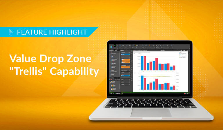
One of the key drivers in the Pyramid 2018 design was the data visualization engine and the flexibility it affords users in visualizing data for analytics. This required capability not only needed to address the multitude of ways users want to ‘draw’ their data but also to allow the application to port common visual elements from one type of visual to the next. It also needed to support the many query styles and ‘shapes’ a user can create in Pyramid’s Discover tool. The last issue to address was adding higher-level analytic functionality through the visualization process – so non-technical people in an intuitive, point-and-click UI can use that advanced techniques.
Click here to see an example of the many permutations that can be created with Pyramid’s visualization software.
The solution to interactive data visualization in Pyramid 2018 was ultimately driven through the drop zone engine, which is designed to take the old “columns” and “rows” concept – used over the last 20-25 years in products like Excel, ProClarity, and even Pyramid’s own BI Office – to the next level. With drop zones, users can easily drag analytic elements into specific areas, which then instantly appear in the visualization.
Although there are similar concepts in other products like Power BI, Spotfire, and Tableau, the Pyramid 2018 version is designed to simultaneously simplify the functionality while extending its sophistication at the same time. Much of this can already be seen in the current Pyramid release, with more of that to come.
Currently, 36 core data visuals or charts are available in Pyramid (with more on the way). Using the drop zones, these can be extended to well over 150 differentiated data visualizations that do not include permutations for formatting or ‘soft’ (headers, axes, legends, etc.) adjustments in the design of the presentation. And to potentially extend the capability of this visualization tool to have an endless list of visualization options, Pyramid will soon be adding a custom data visualization API and programming model based on the D3 JavaScript graphics library.
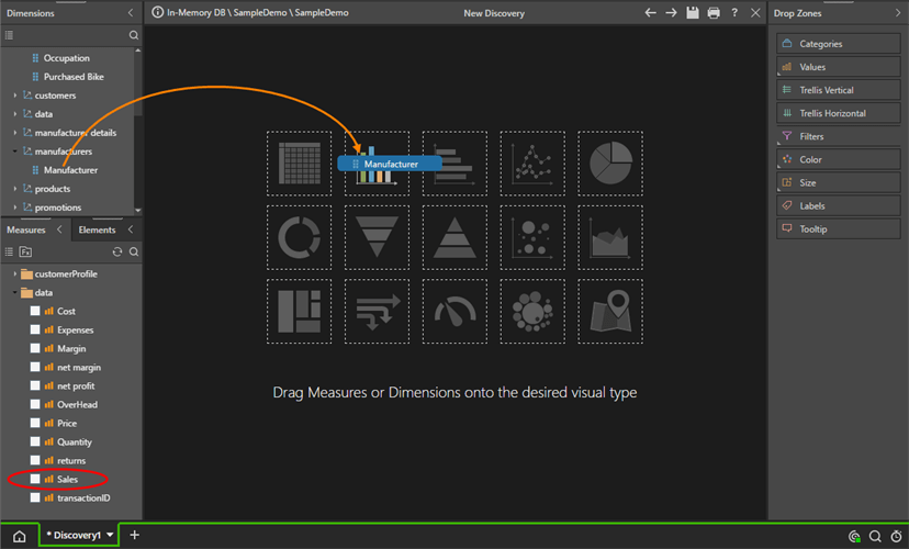
The following walk-through will highlight the drop zone mechanics in Pyramid 2018 and demonstrate the flexibility and power of Pyramid’s data visualization engine. Using a standard column chart setup, we are able to create 12+ extended variations with some basic changes in the drop zone configurations.
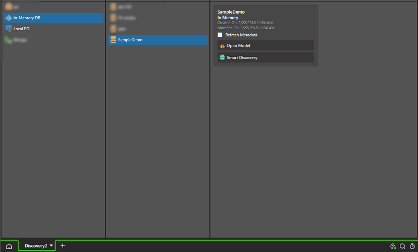
Start by opening a new Discover session using the In-memory Sample Demo database provided in the standard Pyramid install.
Add the manufacturer hierarchy to a column chart and then click Sales in measures.
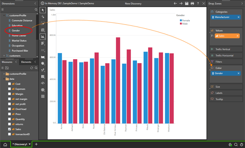
You’ll get the chart shown below – a standard column chart – with manufacturers as the categories in the chart.
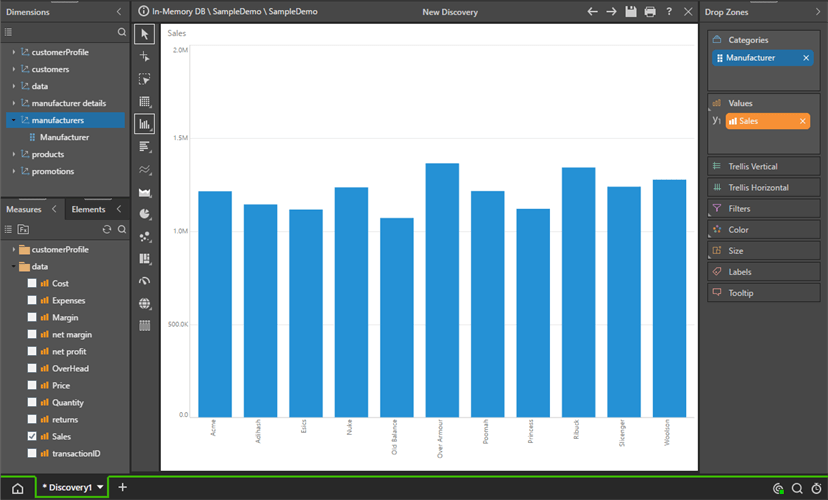
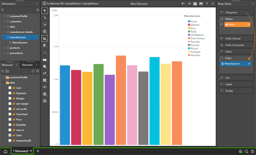
Dragging the manufacturer’s blue chip to the color drop zone will instead show manufacturers as the series in the chart, each with its own color.
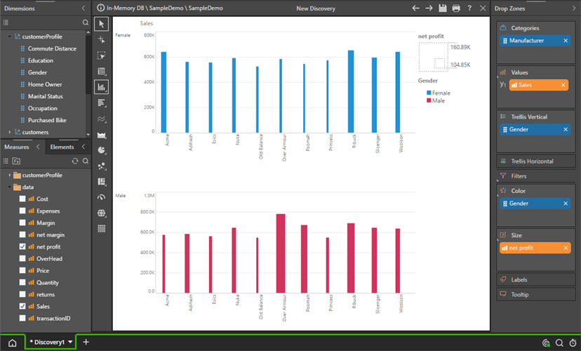
Now drag the Gender hierarchy (column) from the ‘customerProfile’ dimension (table) to Color. This will provide a dissection of Sales by Manufacturer by Gender.
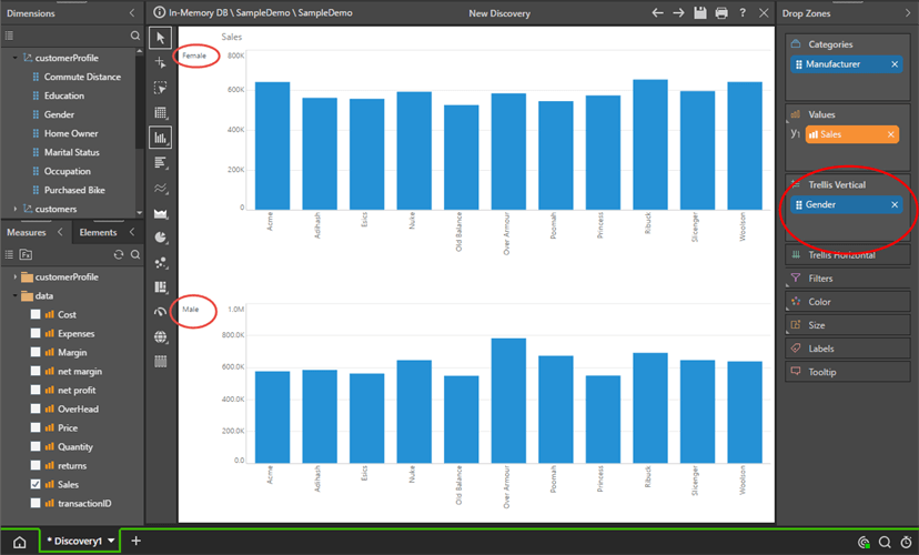
Moving the Gender blue chip to the Vertical Trellis will create a multi-chart of Manufacturer Sales, broken out by Gender.
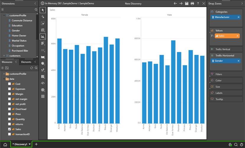
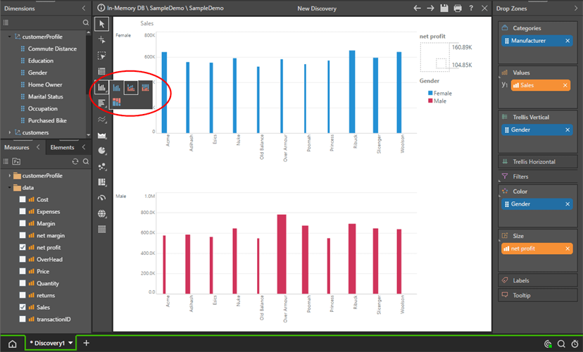
Moving it to the horizontal Trellis has a similar effect. Be sure to choose ‘Scale to Fit’ in the component formatting ribbon to see all charts at once.
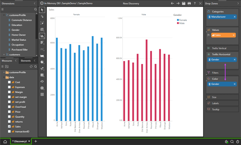
By adding the Gender hierarchy to Color as well as Trellis, we are able to color each chart series in the multi-chart by the same elements driving the multi-chart.
Let’s Move back to a Vertical Trellis, and add the measure ‘Net Profit’ to The Size Drop Zone. This creates an interesting effect where each bar’s thickness is driven by net profit, while its height (the usual column chart effect) is driven by Sales.
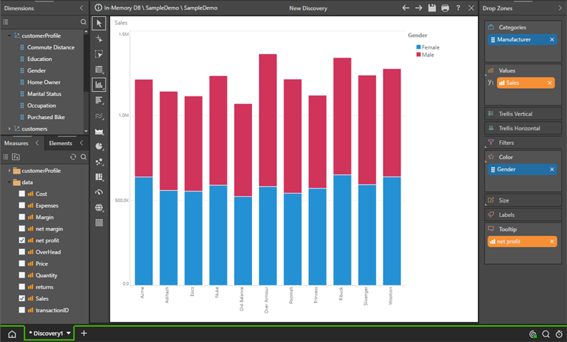
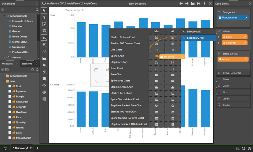
Right-click on the Column Chart widget in the toolbox, and choose Stacked Column Charts. And Remove the Gender chip in Vertical Trellis.
This will change the columns into a stacked column chart, with bars broken out by Gender.
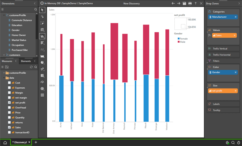
Moving ‘the orange ‘Net Profit’ chip to size will again produce an interesting chart, where the width of each data point in the chart is driven by net Profit and its height is driven by Sales.
Next, remove Gender, and drag Net profit to the color chip.
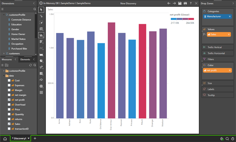
The columns in the chart now are colored using a simple linear model of values from high to low based on Net Profit figures for each manufacturer (The height is still being driven by Sales).
Next, drag the Net Profit orange chip back onto the Color drop zone header, and then choose the ‘Average’ Sub-drop zone in the fly-out.
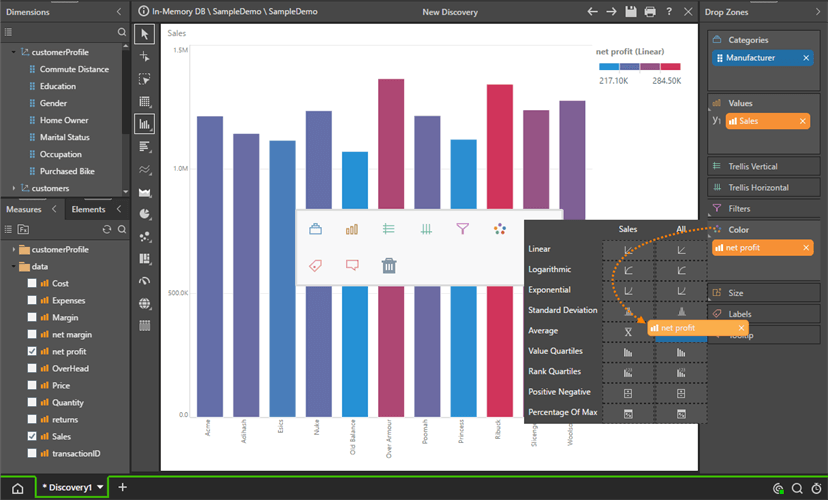
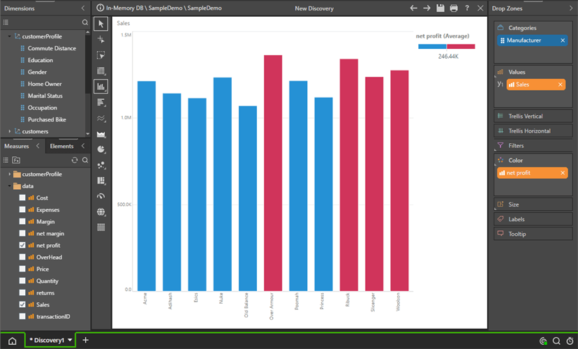
The columns are now colored using above or below-average Net Profit values.
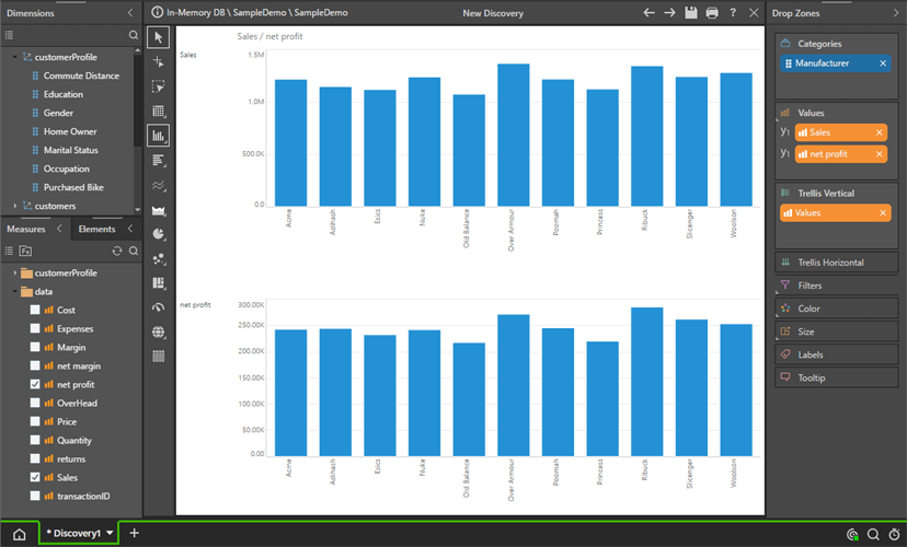
Next, drag net profit to the Values drop zone.
Since there are 2 values, the engine automatically builds a special “Values” orange chip and puts it into Vertical Trellis – to show both measures.
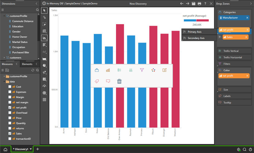
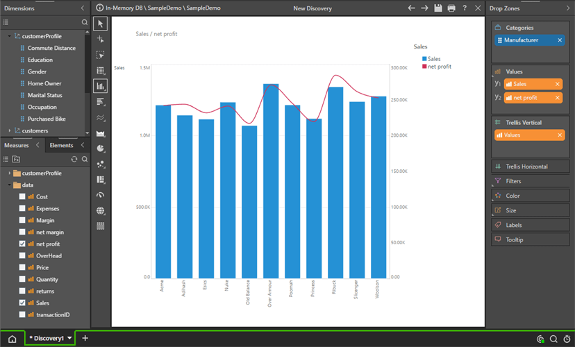
Re-drag Net Profit onto the Values drop zone header and choose Secondary Axis > Spline Chart.
And now you have a Combo chart with both Sales and Net Profit combined.
 \
\
Data visualizations are crucial in business analytics and can provide non-technical users with an intuitive, point-and-click UI to access advanced analytic functionality. Pyramid 2018’s drop zone engine has taken the traditional “columns” and “rows” concept to the next level, allowing for greater flexibility and sophistication in visualizing data. With 36 core data visuals and the ability to create well over 150 differentiated visualizations, the potential for customized visualizations is endless.

How-To
SAP is essential enterprise software. Your organization has made significant investments in SAP. You've tailored…

How-To
Pyramid’s built-in multi-factor authentication (MFA) option adds a rock-solid layer of security to your BI…

How-To
Administrators occasionally need to check complicated settings and security structures for users. Sometimes the easiest…

How-To
Pyramid lets users customize and personalize the labels of value metrics and hierarchies for a…
How-To
Static data format masks, used to format values in analytics) is a standard feature in…
How-To
Pyramid lets users display multiple value metrics in a single report, each with its own…

How-To
Pyramid’s persistent color feature maintains the same color in all visualizations for selected data elements,…

How-To
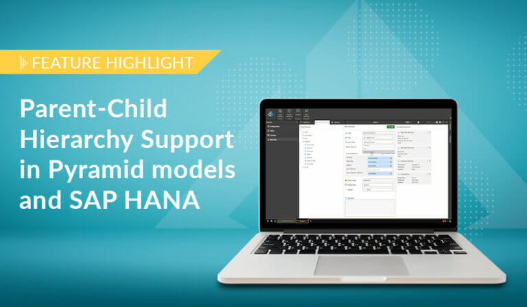
Pyramid offers flexible, intuitive security for parent-child hierarchies, providing role-based control over how members are viewed…
How-To
Pyramid excels in its’ native support for parent-child hierarchies, automatically generating hierarchical structures and providing fluid,…