
- Solutions
-
-
Featured Solution
 Get more value from your existing SAP BW and SAP HANA investments with our SAP integrations.
-
-


Visualizations are effective tools to simplify complicated business challenges. They can turn data into meaningful and actionable information. They can reveal previously obscured data trapped in tables and grids and transform it into actionable information. Data visualizations have transformative power.
Modern analytics and BI software tools have tapped into this prevailing belief: See and understand your data! Visualize your data instantly! Beautiful charts and dashboards are splashed across their homepages.
The power of data visualization in their brands and products is undeniable.
But when we roll up our sleeves and get to the business of solving real problems, we run into issues. Our data is out of date or incomplete. We’re at the mercy of others to provide access. We have one tool to model the data and four others to do anything useful with it.
Despite seeing the potential of data visualizations, we’re stuck before we even start.
In The Back of the Napkin, business author Dan Roam explains how humans are prewired to understand visual information. We can simplify even the most difficult and complicated business problems using drawings, charts, and visualizations.
He breaks the visual thinking process down into four discrete steps:
Roam says we often struggle to create effective visualizations because we tend to start with the “show” process first, before we’ve had a chance to truly look, see, and imagine.
“This tendency to equate visual thinking with the creation of elaborate and refined drawings is just plain wrong. It approaches the process of visual thinking backward, limiting our most powerful problem-solving ability before we’ve even had a chance to really use it. That’s because showing . . . Happens at the end of the visual thinking process, not the beginning.”
It’s a trap many fall into when using analytic tools. The visualization is the tantalizing artifact that we think will reveal everything. But the legacy tools and point solutions we use to create the visualizations leave out vital components. They make it hard for you to collect and screen information and the discovery toolsets are limited and unsophisticated. And while they can produce glossy charts and dynamic views, the underlying data only gives you part of the story.
The problem only gets worse in an organization.
 Analytics-based decision-making is best when it’s collaborative. And in all collaborative problem-solving efforts, we play different roles depending on where we fit in the process. Are we the preparer/sender (the analyst) or are we the receiver/audience (the business user/decision maker)?
If we’re the preparer/sender, we can’t start with a visualization. We must start with the data and go through a systematic, iterative process to extract meaningful insights. This requires data access—to all sources—as well as modelling and discovery tools. Then we must add context to fully communicate our findings.
If we’re the receiver, we may start by examining a chart or series of charts on a dashboard. But it too is only the start. Context is everything. We must understand the underlying context: What am I looking at? Does this give me answers to my questions? Is the underlying data trustworthy? How does this relate to other data views?
Thus, from either direction, analytics must go beyond visualization.
But if the tools we rely on just reduce the analytics process to a visualization exercise, we’re only making things worse. Many, in fact, give short attention to the aspects that matter most when conducting collaborative analytics: data access, governance, and scalability. Without them, chaos reigns, individual departments produce views on limited datasets, and the winner is the one with prettiest chart.
So while you have some visibility into your business challenges, your analysis is often incomplete or invalid because your BI tools can only produce limited views based on incomplete data. Most BI tools haven’t been able to solve the problem created by data siloes. That’s why so many visualizations fail to aid in the decision-making process: they’re based on out of date or incomplete data!
However, if you treat visualizations as a component of the analytics process—the natural result of thoughtful and systematic analysis—then you’re honoring the larger analytics process as a whole. If you’re building the visualizations using a complete platform, thoughtful decision-making, not the visualization alone—becomes the culmination of the analytics process.

BI Trends
2023 was the year of AI in almost every industry. However, when it comes to…

Thought Leadership
Introducing Data Shark Podcast, with Omri Kohl Pyramid Analytics’ CEO, Omri Kohl, is a busy…
Thought Leadership
Organizations that use analytics often experience a gap between analytics results—the products of data preparation,…
Events
Disclaimer: This article is the opinion of Pyramid Analytics and does not constitute an endorsement…
Events
Disclaimer: This article is the opinion of Pyramid Analytics and does not constitute an endorsement…

Thought Leadership
Has “augmented analytics” reached peak hype? It certainly feels that way. Countless software vendors in…
Thought Leadership
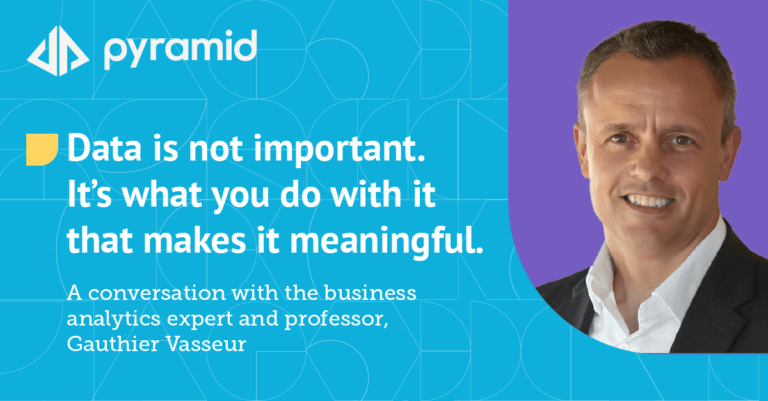
A conversation with the business analytics expert and professor, Gauthier Vasseur “Data is not important.…
Mythbusting
Data replication is the process of storing the same data in multiple spots to improve…
Mythbusting
Does it still make sense to take a department-by-department approach to analytics? Can you invest…