
- Solutions
-
-
Featured Solution
 Get more value from your existing SAP BW and SAP HANA investments with our SAP integrations.
-
-


Analysts building dashboards reach an impasse when attempting to combine visualizations from different data models (for example, a sales analysis from an SAP-based data model and marketing KPIs from an Oracle-based data model), as many BI tools only allow a single data model per dashboard (or project).
One way to address this has been with single data sets in the era of data lakes, where organizations attempt to pool all their data into a single data source so that they can get a homogenized single source of the truth. Unfortunately, data lakes are complicated to build, can take years to deliver, and lack the agility to respond to the fast-changing data landscape for both organizations at large and users specifically.
Pyramid works extremely well with data lakes—using them without needing to ingest the data. But it also supports a different approach to combining data and analyses from multiple sources. Pyramid can comfortably combine multiple elements from different data models and data sources in the same dashboard analysis without the extensive frameworks needed in a data lake solution—effectively creating an “Analytics Lake.” While this approach does not attempt to achieve the lofty goals of a data lake, an analytics lake is significantly faster and easier to deliver and deploy than its much more complex cousin.
Users often need to display data elements from different data models in a single dashboard: a finance KPI, next to an HR KPI, and next to a marketing KPI. Further, analysts can’t use common filters or common data elements across models due to different data structures in disparate models.
Most self-service BI tools (e.g., Qlik, Power BI, Tableau, etc.) do not allow multiple visualizations from different models in the same dashboard or project. Instead, they encourage users to export their raw data and reimport it into their native data stacks to create a single data model. The duplication of data breaches data governance and security; duplicates analytic layers; decentralizes the “truth,” and ultimately deleverages the investments in the underlying data warehouse.
Alternative strategies like “composite data models”—where multiple data models are merged into a single source virtually have significant performance issues—don’t scale and are often limited to relational sources only.
Pyramid offers a set of tools known as “Cross Model Mapping,” which allows business users to create the framework and rules to glue the pieces together without all the aforementioned issues. Advanced mapping can be performed to map data models, hierarchies, and members. All mapping is performed using a wizard with a simple point-and-click UI.
Dashboards can now comprise visualizations from multiple data models, where each model can comprise a plethora of different sources—without the need for a data lake, and without the need for a multi-year project to deliver a single common view of a business problem or organization.
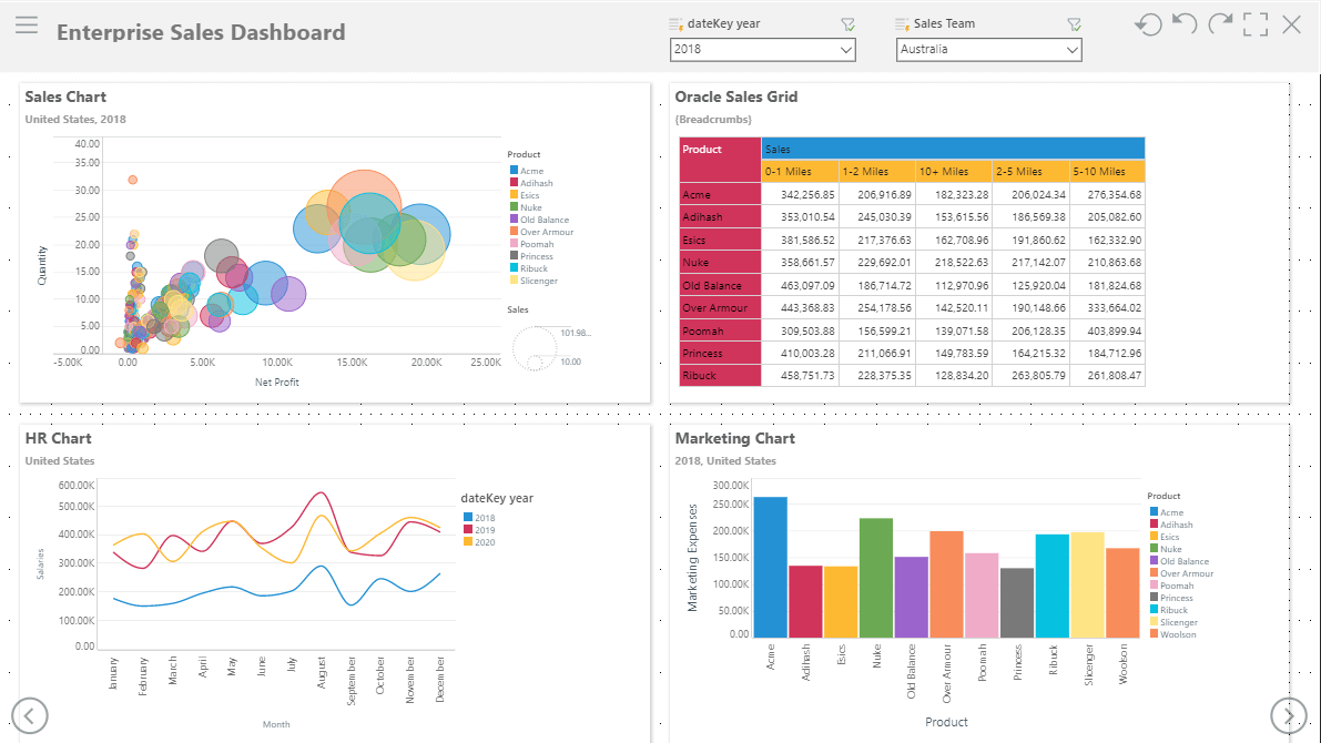
Shane is a BI Analyst for E&G Manufacturers. E&G uses SAP BW to analyze their SAP ERP. They also source HR data from their SQL Server-based HR system; their marketing data resides in a Redshift database in the cloud; and their legacy manufacturing data is stored in Oracle. E&G has deployed Pyramid to power their enterprise BI analytics. The four systems have been encapsulated in distinct data models, thus obviating data duplication, maintaining strict data governance, and safeguarding a “single version of the truth.” However, the CEO wants a master dashboard with KPIs and charts from all four systems to give her a view of the entire operation.
Shane plans to use his existing sales dashboard from his SAP data model and wants to interpolate graphs and grids from the other systems, with the ability to use common filters and interactions across the visualizations. Using Pyramid’s Cross Model Mapping, Shane can easily define the common relationships between the systems, enabling fluid interactions across all four models.
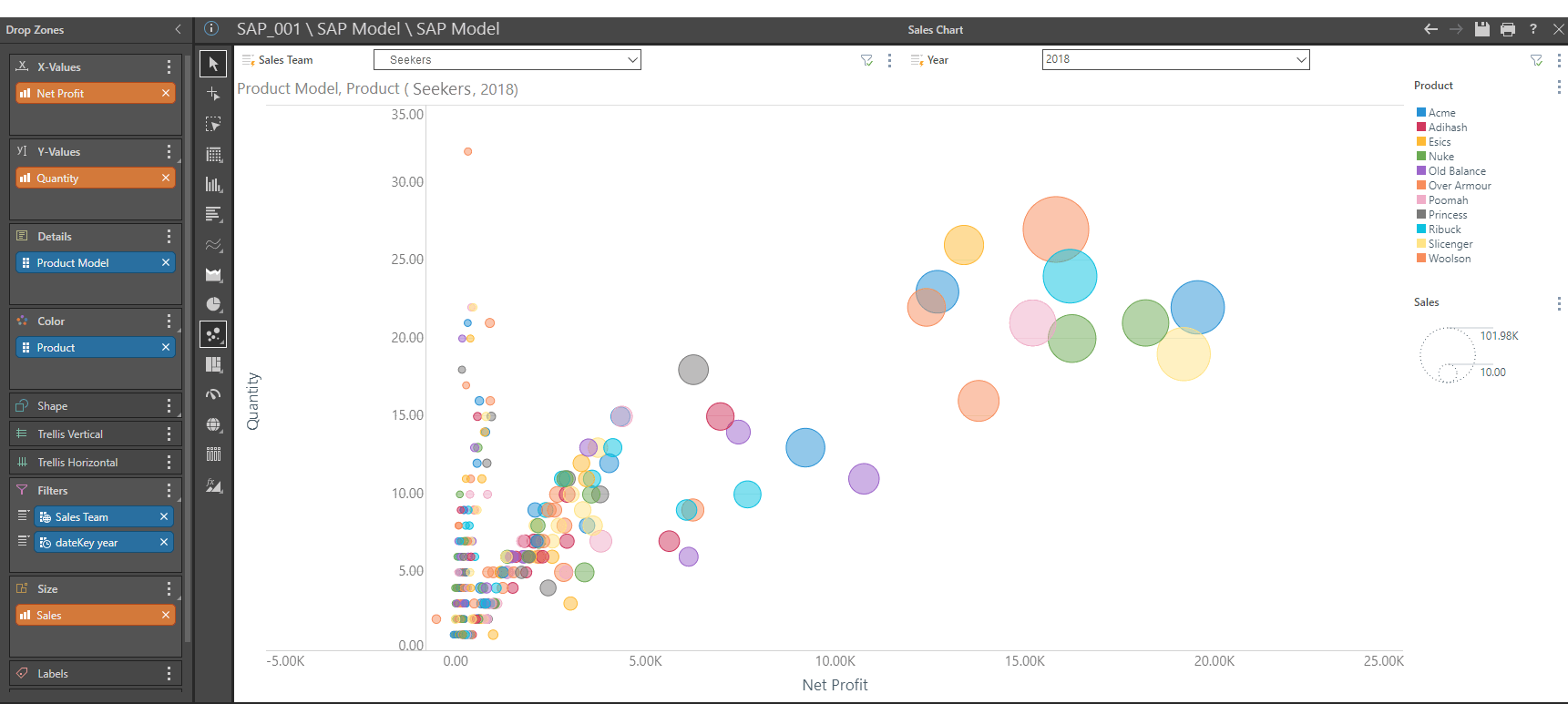
This is Shane’s sales report from the SAP system. This scatter plot graph plots Net Profit (X-axis) against Quantity (Y-axis) and increases the size of bubble dependent on Sales. This report is filtered using sales team and year slicers for all product models, where the product color is displayed in the legend.
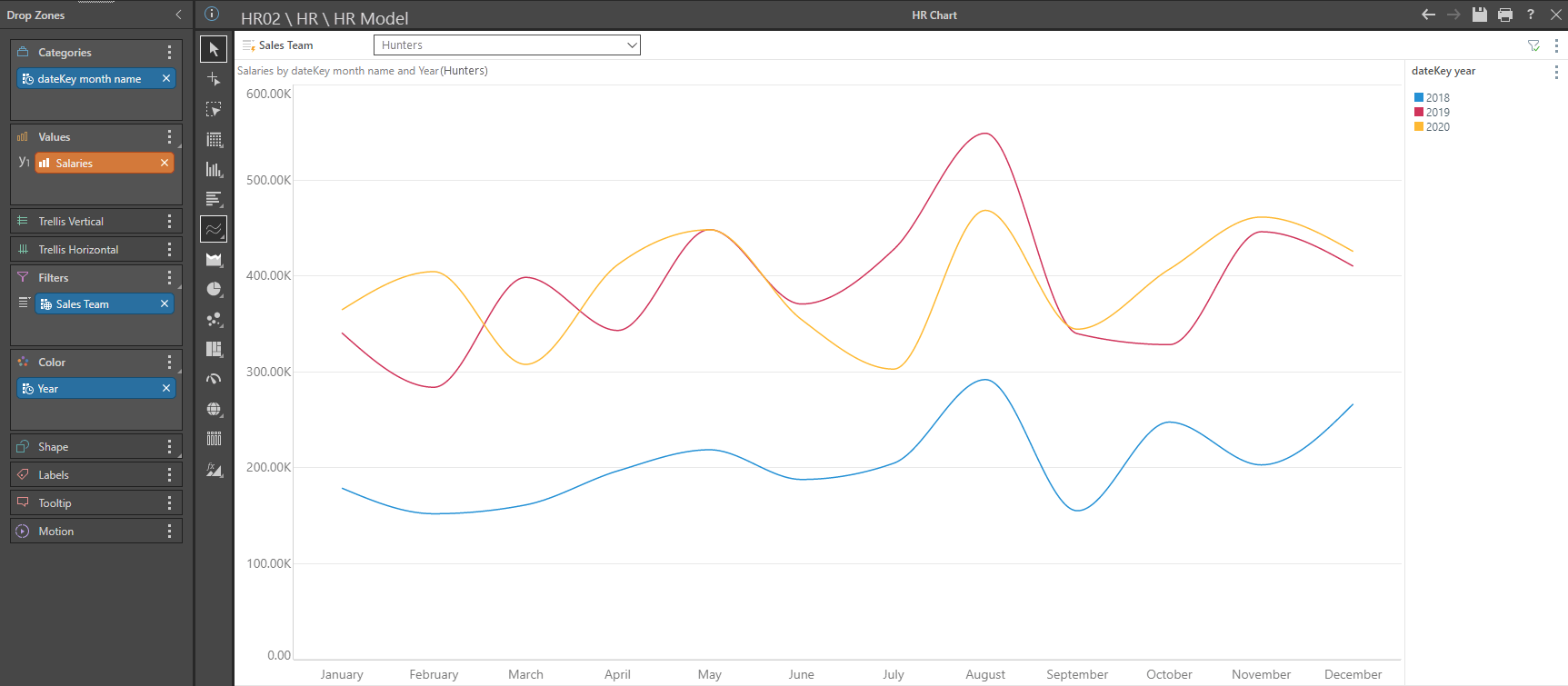
This is a graph from the HR system depicting salaries for the Hunters sales team for the years from 2018 to 2020.
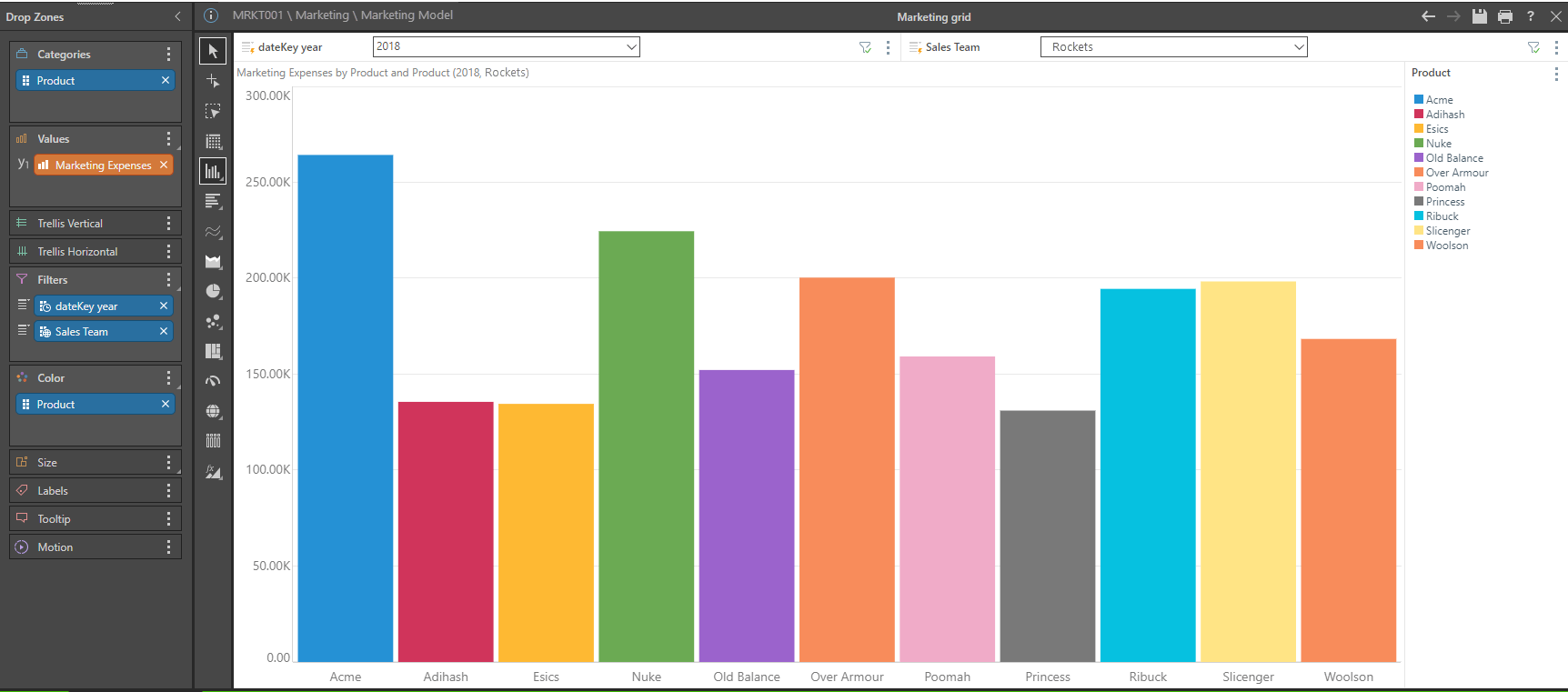
This graph reflects marketing expenses for the Rockets sales team per product for 2018.
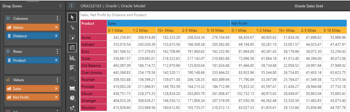
E&G still use their legacy Oracle sales system for certain products with local deliveries and would like to include these reports in their new dashboard. This report displays sales and net profit per product with travelling distance from the branch.
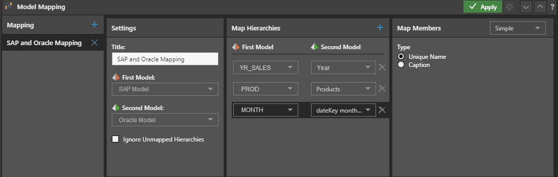
Shane wants to combine the dashboards, but the SAP data model and the Oracle data model use different dimensions and table names, even though the members within the dimensions are identical. The naming conventions for dimensions deployed in this SAP implementation used YR_SALES, PROD, and MONTH. In contrast, the Oracle dimensions are Year, Products, and datekey month name. Shane uses Pyramid’s simple model mapping wizard to align the two models, by simply selecting the models, and mapping the disparate dimensions, using their unique name.
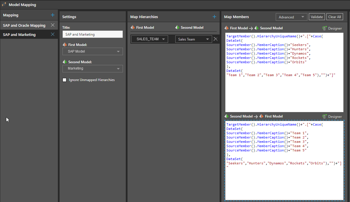
Before attempting to map the SAP model against the marketing model, Shane has to ensure that the team names used for members in the SAP model are mapped against the convention used in the marketing system where the teams are referred to by their team number, not the team name.
| SAP Model | Marketing |
|---|---|
| SALES_TEAM | Sales Team |
| Seekers | Team 1 |
| Hunters | Team 2 |
| Dynamos | Team 3 |
| Rockets | Team 4 |
| Orbits | Team 5 |
Here, Shane uses the advanced mapping feature to apply a “SAP and Marketing” model mapping by selecting the models, the sales team dimensions in both models, and applying Pyramid’s native PQL code to map the members in both directions, thus enabling both reports to sync members and interact with each other in the dashboard.
After mapping the four disparate models together, Shane is now able to combine all visuals in one dashboard. His year and sales team slicer will filter all visuals, and the products will interact with each other when selected from any of the visuals.
Analysts building dashboards can’t combine visualizations from different data models in most other BI tools—since they usually only allow a single data model per dashboard or project. Pyramid’s powerful cross-model mapping wizard defines relationships between hierarchies and members from disparate models, enabling the combining of dashboard elements from multiple data models. Dashboards can then include visualizations from multiple data models, where each model can include multiple sources. All this is performed with a simple point-and-click methodology—no coding required.
While building a single data source (the “Data Lake”) is a lofty goal, it may take too long and become too complex before it can deliver any dividends. The idea of an “Analytics Lake”, on the other hand, may provide a faster, easier, and more agile solution to building a “single view of the truth.”

How-To
SAP is essential enterprise software. Your organization has made significant investments in SAP. You've tailored…

How-To
Pyramid’s built-in multi-factor authentication (MFA) option adds a rock-solid layer of security to your BI…

How-To
Administrators occasionally need to check complicated settings and security structures for users. Sometimes the easiest…

How-To
Pyramid lets users customize and personalize the labels of value metrics and hierarchies for a…
How-To
Static data format masks, used to format values in analytics) is a standard feature in…
How-To
Pyramid lets users display multiple value metrics in a single report, each with its own…

How-To
Pyramid’s persistent color feature maintains the same color in all visualizations for selected data elements,…

How-To
Pyramid offers flexible, intuitive security for parent-child hierarchies, providing role-based control over how members are viewed…
How-To
Pyramid excels in its’ native support for parent-child hierarchies, automatically generating hierarchical structures and providing fluid,…